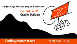
Carl – I can see that you have an interesting concept here. The logo seems to be “moving” in relation to the mountain… and I think your quote says something about “up one side and down the other”… although I can’t really read it. And… so that will be the problem. The design is so similar between the sides, we could easily just think they are the same on quick glance. So… how can you play with this idea and make it more obvious? And, at the same time make the 2 designs significantly different… so we don’t mistakenly think you are just lazy and are repeating the design?
Maybe, the backside should hold a larger quote, and we should “see” a smaller logo traveling up and down the mountain edges establishing rhythm? You will need to then play with the opacity of the logo… so we get the idea that it is moving from position to position. OR, use the logo large and bleed it off an edge as it sits next to the quote - in that case you would not include the mountain either.
What ever you do to the back, you will not need to repeat your contact info… make sure you are offering us something new, a new idea, a new assortment of elements on that backside.


Nicely done Carl, Is the text part of the design *Design change.......* on the backside of your business card?
ReplyDeleteYes it is
Delete
ReplyDeleteCarl – I can see that you have an interesting concept here. The logo seems to be “moving” in relation to the mountain… and I think your quote says something about “up one side and down the other”… although I can’t really read it. And… so that will be the problem. The design is so similar between the sides, we could easily just think they are the same on quick glance. So… how can you play with this idea and make it more obvious? And, at the same time make the 2 designs significantly different… so we don’t mistakenly think you are just lazy and are repeating the design?
Maybe, the backside should hold a larger quote, and we should “see” a smaller logo traveling up and down the mountain edges establishing rhythm? You will need to then play with the opacity of the logo… so we get the idea that it is moving from position to position. OR, use the logo large and bleed it off an edge as it sits next to the quote - in that case you would not include the mountain either.
What ever you do to the back, you will not need to repeat your contact info… make sure you are offering us something new, a new idea, a new assortment of elements on that backside.