Now in their older editions, they had used a difficult to read typewriter font for their body copy, which I intend not to use for body copy if possible. However, since they like that font, I am using a similar font for the headings of the cover as shown. The title is in Veteran Typewriter, the subhead (which will be ideally used as headings in the meat of the magazine) is Typewriter, and the other type is Advent Pro, which I thought paired well with Typewriter. I specifically looked for fonts that are free for commercial use, just in case.
The white rectangle has to be there, its for the bar code and has to go in that exact spot.
Any suggestions that could improve this design would be greatly appreciated. I have not presented this to my client yet, as I'd like to see if it can be improved first.
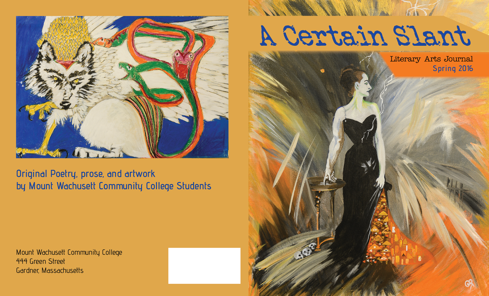
Ian – Complimentary colors work fine (but they often don’t in visual design… do you know why?), and here are some thought:
ReplyDelete1. You have 2 competing angles on the cover – why? The backwards slant of the type establishes the slant that you should use for the right hand edge of that text frame, no? Is there a reason to introduce 2 angles? I see that you are repeating the text angle at the left edge of the bright orange box - that makes sense to me. However… I question the color of that small text (Literary Arts Journal/Spring 2016). I don’t think you should have a contrast in color, and I wonder if you’d consider pulling an off-white from the painting to style your text?
2. Back cover: Have you considered a tint of that orange for the background back here? It might not overwhelm the artwork as I see it does here. It is interesting that the line “Original poetry, prose, and artwork…” sits on the back. Would that not make more sense as a subtitle on the cover? (Watch your capitalization in that line).