Showing posts with label Ian. Show all posts

Sunday, April 24, 2016

Portfolio Inserts and first page

I did a design for the first page of my portfolio, which I intend to use to introduce myself and my brand. This is intended to be 14x9. I also designed inserts, 2x9, to be placed on the side of the portfolio page closest to the spine. This will be used to provide a description of each project. The arrow shown will be pointing in the direction of the project, but aside from direction of the arrow the insert will have the exact same layout throughout.
I am open to any ideas anyone has for improvement.

First, the first page:


Now the insert:


CD cover mark 1

This was originally a personal project, done as a digital painting. To adapt it to my portfolio for Graphic Design, I decided to turn it into a CD cover. After getting advice from a few people, I decided the painting best fit the feel of a trance/electronic album. The made the title of the album and the track listings reflect this. I used a wispy typeface for the album title and used blending modes to make the text affected by the texture of the background so to incorporate the type into the painting.
I am open to any advice on design decisions, but I am no longer able to alter the background painting itself.


Dragonshop Mock-Up Mark1

This project was originally done for Advanced Digital Imaging, and as such was never turned into an actual website. This mockup is of a website that does PhotoShop tutorials for people who are learning digital painting. My target audience is young creative people, from young teens to young adults. As such, I used bright, trendy colors against a black background.
I made some changes from my original version. I redesigned the banner entirely. It used to have a difficult to read typeface against a useless bright shape. I changed it to a fantasy-inspired font to go with the name "DragonShop." I also created the logo for DragonShop, as shown on each side of the banner. I incorporated the blue from the logo into the subheadings, I brought up the opacity slightly of the background image, and updated the bottom information while adding a box to the back for visibility.
I am open to any feedback you all might have on this.


Saturday, April 16, 2016

Spieler Ad Mark 3

Changes were made to the logo in form of placement and distortion. Tagline was adjusted to better place elements.


Tuesday, April 12, 2016

Spieler Ad, Mark 2

The only real change I made here was redesigning the logo to something more readable and more bold, and changing the position of the elements.
All thoughts and advice welcome.


Resume Rework

I did a slight rework to my resume: I changed some of the wording as requested, I changed the body copy from the Advent Pro family (which was too fancy) to Museo Slab, cleaner, easier to read slab serif. I changed the location of the social media links, as they were bothering me where they were, and added my contact information to the top. To fill the white space left where the social media links used to be, I changed the size of the skills boxes, the speech bubble, and raised the leading and the space after paragraphs in the left-most column.


Business Card Mark 1

This is my first iteration of my business card. I decided to simply tie in my resume and cover letter design elements to a business card format, while giving it the fun twist of being a portrait card with rounded corners. The black backgrounds are for reference only and are not part of the design, as the template from Moo.com required a bleed area that would look odd to show when displaying them on the blog.
I am open to ideas regarding changes to this card, but would rather not change it from portrait or from rounded corners.


Monday, April 11, 2016

Spieler Ad Mark 2

So, after reading comments on my Spieler ad I decided to redesign it entirely. I kept the border and the logo, but found a free-for-commercial-use image online to use for the background image that I felt fit with the idea of the product a bit better, as Spieler was intended to be a sports/tennis shoe company. I added the tagline "As tough as you are" to tie the other elements in to the overall message. I went with Arial Black for the tagline font because I wanted it to have a solid, sturdy feel.
I might need some advice regarding the logo placement. I messed around with it a bit but couldn't seem to find a better spot for it, though something about it seems off.


Thursday, April 7, 2016

Spieler Ad

This was originally done for a Marketing course here at the Mount. We had to make up a shoe company for a simulation, and create a logo and advertisement for it.
If an ad like this were run, it would likely be a magazine ad. Its targeted at teens and young adults, mainly males, which I express through the color and texture. The metallic aspects of the design are intended to represent toughness.
I am looking for any thoughts on adjusting this design.


Thursday, March 24, 2016

Resume Design, website, and more! -Ian Bright

I designed my resume and frankly I'm pretty psyched about it, so I may not be willing to change much in the overall design, however I am more than open to suggestions if anyone has them just in case I'm missing something. Also, the social media links actually link to social media pages I created. The social media pages aren't quite finished yet, but they exist. But wait, there's more!


I have the beginnings of my online portfolio! I looked at the various options and decided to go with Carbonmade. I'm paying for their unbranded version so I could get my own domain, which I bought. Feel free to visit http://imbrightdesign.space/ and let me know what you think.

Wednesday, March 23, 2016

Art Club Flyer - Mark I

This was originally a flyer specifically for a bake sale the club was having at the time. I reworked it to be a general flyer for the art club. I took out and changed some of the fonts, I had originally used too many. This is intended to be letter size.
I feel like something is missing though, and I can't quite figure out what, so I am more than happy to hear suggestions. Also, I don't know if this is still the current time and location for the Art Club but if they have moved and someone here is still in it, let me know. Doesn't hurt to be accurate.


Type Poster Rework - Ian Cook

This project was originally for Typography. The assignment was to create a poster advertising a Type combination for a fictional company, "TypeCombo.com." We were to use a font created by our assigned research typographer and one that would combine well with it. Mine was William Caslon, so I used Caslon with Museo Sans and created this poster. It was intended to appeal to clients interested in and/or working with antiquity which I attempted to reflect in my color and texture use in addition to the obvious type choices. The background texture is intended to resemble parchment and is created entirely from type. The selling point of it is intended to indicate that Caslon and Museo Sans can be used with either being the headings and either being body copy, hence "One Way or Another."
I made some adjustments to the original leading and removed the justification of the paragraphs (which had previously made the letterspacing a touch wide). I also noticed a difficulty with readability against the textured background, so I added boxes behind the affected paragraphs with a slight transparency to let the texture through. This is intended to be 11x17.
Let me know if anyone has any suggestions for modifications to this design.


Sunday, March 20, 2016

2-color Logo, mark I

I made some adjustments to the original black and white logo and went on to create a 2-color version. I went with blue for a second color because it is both the color of my eyes and oft used in logos having to do with technology/progress.
Feel free to let me know of any improvements I could make to the design.


Monday, March 14, 2016

ABG Poster rework - Mark I

This project was originally done as a service learning project for the Marketing class. In this service learning I worked with the MWCC business honor society, Alpha Beta Gamma and their head Professor Linda Bolduc. My original was portrait and was poorly designed when it came to typography, visual hierarchy, and use of positive and negative space due to my then lack of knowledge regarding those concepts.
The rework has been changed to landscape for better distribution of elements, uses the Arial family of typefaces as that is what appears to be in their logo, and uses color pulled from the logo as well. The image is pulled from their website, and their logo was given to me by them, not designed by me (so I cannot change the logo really). I will probably send this to Professor Bolduc when it is finished in case they decide they like it and want to use it.
I am open to any and all feedback regarding this design. I would also like to ask whether it would be a good idea to add a drop cap to the first paragraph?


Wednesday, March 9, 2016

Menu Rework Mark I

This project was originally done for Publication Design. The project was to create a menu for an imaginary restaurant that is themed around a specific art movement and artist within it. My topic was surrealism and my artist was H.R. Giger.

The menu is themed heavily around showing Giger's works as the background images of each page. Originally, I had made metal covers. They unfortunately did not work as planned, so I designed a new front cover and front inside cover, and will use the last page "About H.R. Giger" as the back cover with the intention of creating a saddle-stitch binding method. I did little on the interior pages but I did address some issues that might have been confusing for the viewer in various areas.
I am seeking any and all criticism and suggestions on improving this design.


Friday, March 4, 2016

A Certain Slant - More Covers

I made two additional covers to present to my client for service learning. The first one I'll post here for comparison, even though it is also posted below for feedback. She said she was interested in possibly using Kyle Johnson's art. I spoke to Kyle and got high-rez images of his work, and went on to make two covers: one with both covers displaying his art, and one displaying one of his and one of the other images I was given (I wasn't told the name of the other artist).
I plan on presenting all three covers to her so I would like thoughts on not only which is strongest, but also on how to improve all three.

The first one, which I had posted earlier this week:


The second one:


The third one:


Black and White Logo - Mark II

Based on feedback I received, I made some adjustments to my black and white logo. I changed one of the bulb screw shapes to extend and curve with the book below it to resemble part of the book as well. I changed the typeface to Kingthings, which I found to be more akin to the thick lines and curves used in the symbol.
I am open to further feedback, but I am rather happy with it.


Samael Portrait - Mark II

I took some of the suggestions from last week and have reworked this portrait to include more expressive typography that utilizes more of the negative space. I tried adding some sort of ground plane but it conflicted a bit too much and crowded the other elements, so I removed it and placed a slight shadow under him instead. Any further thoughts would be appreciated.


Wednesday, March 2, 2016

Service Learning - Literary Arts Magazine

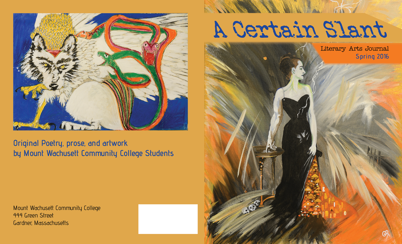
This cover is for my service learning project for the Literary Arts magazine, A Certain Slant. I was given two images to include on the covers of the magazine, which are used here. They gave me a wonderful opportunity to utilize an orange/blue complimentary color scheme. I pulled the blue used in the title from the artwork on the back cover.
Now in their older editions, they had used a difficult to read typewriter font for their body copy, which I intend not to use for body copy if possible. However, since they like that font, I am using a similar font for the headings of the cover as shown. The title is in Veteran Typewriter, the subhead (which will be ideally used as headings in the meat of the magazine) is Typewriter, and the other type is Advent Pro, which I thought paired well with Typewriter. I specifically looked for fonts that are free for commercial use, just in case.
The white rectangle has to be there, its for the bar code and has to go in that exact spot.
Any suggestions that could improve this design would be greatly appreciated. I have not presented this to my client yet, as I'd like to see if it can be improved first.


Thursday, February 25, 2016

Project 3 Rework - Thoreau T-shirt

This was originally done for a project for digital illustration. The project was to choose any quote from Henry David Thoreau and use it to design a t-shirt around. At the time, the project was intended to be made into actual shirts, and we had a three color limit. For my portfolio, I was able to move past that limit to allow for a much more interesting design. I also changed a lot of the elements of this because of the sloppiness of my original version. I will post the original first below, followed by my reworks for comparison.
I am open to any ideas on improvement of this design, but I may be hesitant as I really like where I took it. However, if something just isn't a successful design choice, I will change it.

Original version:

 Reworked version: