
Monday, February 29, 2016
Sunday, February 28, 2016
This project was our menu for publication design. It is meant to be inspired by an art movement, there is a lot of deliberation and research to this from the menu contents to the way it is displayed. For the mock up the original image was double sided printed which folded to open up as a menu. These "posters" were on a wooden board specially measured to be comfortable to be held. The contents had design elements which were designed from the posters for the art movement; they all share execution in a similar fashion. Unfortunately the project would not sit in a portfolio very well, so they were redesigned to be a single page with the image on the left and the menu on the right. The left side has had the title of the course or menu selection and it's description written into the artwork. The design has also been changed to have an opacity running through backwards to the design on the menu side. This allows for viewing of all the artwork, rather than a portion of it. There are eight pieces in total. The work is for those interested in Polish art and food, the history in general is rather interesting as well.


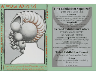


An Example of the Original


Saturday, February 27, 2016
Project 3: Dover Demon Rework 1
The purpose of this project was to take a story and use a collection of images to create a digital imaging composition representing said story. I chose the story of the first sighting of one of my favorite cryptid monsters, the Dover Demon, which was spotted in Dover, MA by some teens driving down a dark country road.


Friday, February 26, 2016


Thursday, February 25, 2016
Project 3 Selling Fonts
This was my Typography Visual Communication GID117 SGI project. Where we were assigned a case study, and had to sell a pair of their fonts. My case study being Matthew Carter the creator of the fonts Verdana and Georgia.

Have any recommended changes feel free to share

Have any recommended changes feel free to share

Project 3 Rework - Thoreau T-shirt
This was originally done for a project for digital illustration. The project was to choose any quote from Henry David Thoreau and use it to design a t-shirt around. At the time, the project was intended to be made into actual shirts, and we had a three color limit. For my portfolio, I was able to move past that limit to allow for a much more interesting design. I also changed a lot of the elements of this because of the sloppiness of my original version. I will post the original first below, followed by my reworks for comparison.
I am open to any ideas on improvement of this design, but I may be hesitant as I really like where I took it. However, if something just isn't a successful design choice, I will change it.
Original version:


I am open to any ideas on improvement of this design, but I may be hesitant as I really like where I took it. However, if something just isn't a successful design choice, I will change it.
Original version:

Reworked version:


Project 2 Rework - Samael Portrait
This is my first rework of my portrait project. I changed the background to a color that provides more contrast and color balance to the piece, while easing it towards neutrals so as not to have it distract from the other elements. I added definition to the right hand, and I added a lyric from a song that he likes. I chose the font "My Biopsy" because of its degraded look which reflects its subject matter and the thoughtful attitude of the piece in general.
I am looking for any additional feedback on how to improve this.

I am looking for any additional feedback on how to improve this.

Wednesday, February 24, 2016
Project 1 Magazine


Just a reminder that this project was assignment for Publication Design class. Assignment was to create a magazine cover, contents page, and feature spread. I made several recommended changes, and I would like to know if there are any more recommended changes that could be made?
Tuesday, February 23, 2016
Black and White Logo - Ian Bright
This is my initial design for my black and white logo. I use symbolism in it such as the eye and the light bulb to both play off my name and imply idea and vision. I use the open book at the bottom to signify my interest in publication design. I didn't want my entire logo to reflect that though, as I am more than open to working on other types of design jobs, which is why I wanted to stress the first two things. I chose a very expressive typeface, took it into illustrator and removed some of the extraneous parts of it that would render the type unreadable at smaller sizes. I am displaying it at three different sizes here.
I'm looking for any and all feedback in improving this design.

I'm looking for any and all feedback in improving this design.

Sunday, February 21, 2016
Holocaust "The White Rose" Illustration

Hello Class, Here is my second project which is my Holocaust "The White Rose" Illustration. For this illustration we had research a topic we picked and had to create an illustration for to depict what happened. I picked the white rose which was a german resistance back then who were against the Nazis and Hitler and tried to get the germans to open their eyes on what was going on and what Hitler was doing and where they were really going. For the review I was told to change the T in the first word on the gate to make it look like a T because before it looked like an I. Then I changed the white background for the information and turned up the opacity so the top part of the box wasn't getting lost because the background was so light behind the box.
Retro Magazine Spread


Hello class, here is my spread from my Retro Magazine for this project I was told to create texture and pattern into the spread that was seen in my cover and my contents page. So to add the texture and pattern I added it to the flower that was also a repetitive content for this magazine. Is this enough or should there be more?

Hello everyone,
Here is my revised magazine about Polly the Parrot. A magazine for parrot owners and enthusiasts. This magazine is all about care, housing, attention and type of food is best for an parrot owners parrot. Basically I removed my blue background and left the background white. Changed the text color and rotated text boxes to horizontal position. I added a variety of different parrots for each page. I hope this revision makes the cut.


Here is my revised magazine about Polly the Parrot. A magazine for parrot owners and enthusiasts. This magazine is all about care, housing, attention and type of food is best for an parrot owners parrot. Basically I removed my blue background and left the background white. Changed the text color and rotated text boxes to horizontal position. I added a variety of different parrots for each page. I hope this revision makes the cut.


Project 2 - Samael Portrait
This was a project for Digital Illustration, in which we were to do a portrait. Now, I will be honest here; I have absolutely no idea what to do with this. Its an illustration, but I can't think of any way to make it more of a design piece, and I would love some ideas on what I can do with it. I like the actual illustration of him the way it is, though I am open to changing the background, the type, etc.


Digital Illustration Thoreau Tshirt
The Original

The Redo


This project was from Digital Illustration, designed to be a three color t-shirt with the fourth color being the shirt's color. The object was to take a quote from Thoreau and find a way to represent it with the illustration. The quote speaks of natures rebirth from a burned forest, which reminded me of the story of the phoenix. I chose to use that as an inspiration giving the forsythia bush the slight appearance of a bird. I felt the explosiveness of the forsythia bush to match a fiery phoenix quite well. The audience would be those who are interested in Thoreau, or in unique T-shirts.
Ultimately what was decided was that what needed to be changed was the typography for readability. We stayed with a serif font because of the old time feeling of Thoreau as well as matching the shirt's qualities. It then became tricky, the only thing to change was the type's color. In the original it was black against yellow, in this design neither of the colors work well placed directly against the yellow. I decided to change the yellow shape to a stroke and change the type to yellow. This fulfilled a dual purpose, possibly easier readability and giving the logs their highlight which was removed. I do find this a bit easier to read, I think the black on yellow could have been too highly contrasting and became difficult to look at. It might also be that the highlight on the original logs needed to be larger to give the words breathing room.
I'm interested in hearing your feedback, I need to know what might make this more readable.
Saturday, February 20, 2016
Project 2 Rework: Chisel & Saw Magazine
The goal of this project was to create a magazine cover, contents page, and feature spread based on a topic of our choosing. I chose to create a woodworking magazine because my dad is a woodworker and I thought it would be interesting to do a project based on a topic that I've grown up around. I've made some modifications from the original pieces; let me know what you think.


Thursday, February 18, 2016


What was sent to the printer.


What it will look like.
This was a part of the service learning for the Media Arts and Technology department for Mount Wachusett Community College. Ultimately, the audience was the department and persons therein.
I gave them three ideas and they chose the one shown here. I'll say that the most important part of Service learning is staying in contact with your client, make sure they want you in the direction you're going and notify them of changes. The original draft had the panels on the light as white and the bulb was a solid circle. In my research I'd learned that this fixture was made for a certain type of bulb with "ripples. I made the change and showed it to him and he thought it appropriate. In turn, he asked me if the panels would be dark as they are in real life, I'd also seen this in my research, and I made the change for him, and it was more successful. This Tshirt had to be ready to go in probably about a week, thus communication was important. In any case, this level of communication is useful because you do not want to be dumping time into things without their consent in what you're doing. It is completely true that one remain in the drawing/sketching phase before going to the computer. You'll want to be showing your client digital works, which I made the mistake of not doing as I had shown him drawings. I didn't have the time to be doing multiple digital files aside from the final one, but you should definitely make the effort to do so.
The project itself was a bit strange, because it was the one color, whatever was going to be printed was in black on a white background. That meant designing with that in mind, take a look at what that entailed with the images above, it was quite strange. The bulb was made with stacked black circles with a white varying stroke. 99% of the lines here are simply strokes with tapering ends, bumped up to large weights.
Tuesday, February 16, 2016

Above is the original draft.

Above is the updated draft.
The changes are found in the T-shirt decal, which has been completely redone, save for the shirt logo. I left the original picture with it for comparison as well as including the original draft to show the stark differences. This shirt decal had been a real irritation to not have been in full detail, and now it finally fits with the image.
Sunday, February 14, 2016
Magazine rework

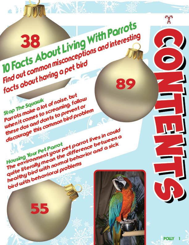


This is my my magazine assignment created in Indesign and photos I brought into Photoshop. This was a fun project, I must say, I enjoyed creating my first magazine. My target audience would be any gender and bird lovers, owners and researchers whom may be looking into owning a parrot. I made many edits and took the advise of my student peers. So what does everyone think, can I make this magazine even better?
Subscribe to:
Comments (Atom)