Project was assignment for
Publication Design class. Assignment was to create a magazine cover, contents page,
and feature spread. My subject was based off of my love for hiking. So my
target audience is anyone who loves hiking, and having outdoor adventures.
I made no edits
to the cover page. So far but when it comes to printing the cover
again, I will have to make modifications with the orange, so it won’t print out semi transparent.
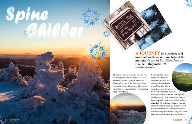
The contents page photos were given a miner drop shadows, so they would each give a sense of perspective
against the background content, and each other. That also goes for the feature
spread pictures as well. On the feature spread I made a few changes to the secondary heading “A JOURNEY ” I enlarged the fraise, and
decided to change color from black to orange for contrast.
If anyone else has advice, or changes that they would make I would appreciate suggestions.
If anyone else has advice, or changes that they would make I would appreciate suggestions.


Nice Job Carl, I think this project looks great. My only suggestion is right above to the right of Spine Chiller there is a circle with an image I think there should be more space under the text and around the circle like the one above to the right of the sunset circle.
ReplyDeleteCarl – I definitely get the idea that this is about an active sport, even a bit extreme with the use of the “X” and your color choice of bright orange. Here are my thoughts:
ReplyDeleteCover – the title type hugs the top trim edge but because of that I’m not sure we see the full word. The large X seems quite separate from the rest of the word. What can you do? Have you considered bringing down the rest of the word and overlapping the “X” a bit – so it unifies and becomes quickly identifiable as “Xcursion”. That will help the upper area of your cover. If I am correct, I see that the orange is your dominant color, and the brown is the secondary color. Which means – they should not be used in a way that they compete with each other. Instead, the brown should support the orange. I suggest you use either black or orange for the rounded shape under the title and then FILL it will type, all the way across – so you have suggested rhythm inside this element… as it sits doing its job of underlying the title. You should be as bold as you can in your masthead… and leave the brown for other purposes. Do not reuse that rounded element (as I see under Spine Chiller) because it weakens the contrast that you want to have in your title. The lower left of your cover has quite a few trapped negative spaces – I think your type is too large, much too large and sitting awkwardly in relation to the photo. Use a very bold type face (maybe sans serif?) but make is small enough to fit well in this area.
Contents – please add that “s” onto the end of Content. The use of brown shapes here makes a lot of sense, but I question so many colors for the type. There is too much contrast in this type column – and one way to approach it would be to use your colors more carefully, and not as many in the same area. Question – how important are the words “Special Feature” and “Feature”? Not really at all, right? So… they should be very much smaller, and serve as section identifiers – incidentals. Make sure to bring down Special Feature to sit right above Spine Chiller – it belongs there and not next to Contents, right? Photos – the middle one is tilted too much, you should straighten it a bit.
Spread – The title is getting lost up there – have you considered placing it at the bottom of your photo in the dark areas? OR – find a way to create more contrast between it and the sky. I question the snowflake positions. They should not be touching the title, and are we supposed to think they are floating down – like in a snow storm? They don’t appear to be doing that at all, by hugging your corners. Rethink your use of this element – it’s a nice element, but you need to figure out how to use it wisely. The bottom rounded image appears to be a repeat of the large image at left (which is a really wonderful image, by the way). Do you need another one? I don’t think so. Let’s use less photos, but larger photos – that is what makes a Feature look like a Feature rather than a Department. Why not use the same approach as I see on the Contents – but rather along the top of the page. Be careful to position the photos so we see the important parts of them… when overlapping photos you need to pay attention to what that overlap is covering up. For instance, the angled blue/black photo at top of the page… I have no idea what it is of.
I’ve giving you a lot to think about – but it will be worth it, this could be a very successful project with more work.
I think the choices you have made have done your design good. There was something from our critique at the end of last semester that I remember, which was to change some images on the spread. For the circle images, you just need to switch the images so we are not seeing the repetition right next to the original image. It's still a good idea to use it to balance out color, but it would work to you're advantage in directing the eye this way as well.
ReplyDelete