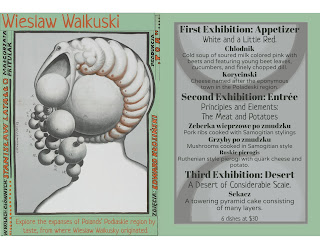
An Example of the Original
Graphic Design student portfolio work from 2-year Mount Wachusett Community College and critical analysis of the work.
Sunday, February 28, 2016
This project was our menu for publication design. It is meant to be inspired by an art movement, there is a lot of deliberation and research to this from the menu contents to the way it is displayed. For the mock up the original image was double sided printed which folded to open up as a menu. These "posters" were on a wooden board specially measured to be comfortable to be held. The contents had design elements which were designed from the posters for the art movement; they all share execution in a similar fashion. Unfortunately the project would not sit in a portfolio very well, so they were redesigned to be a single page with the image on the left and the menu on the right. The left side has had the title of the course or menu selection and it's description written into the artwork. The design has also been changed to have an opacity running through backwards to the design on the menu side. This allows for viewing of all the artwork, rather than a portion of it. There are eight pieces in total. The work is for those interested in Polish art and food, the history in general is rather interesting as well.
Subscribe to:
Post Comments (Atom)


Tom – you area moving in the right direction with you menu, by making this a 16-page menu that shows us artwork on the left, and menu items on the right. I’m wondering what trim size this menu will be, because some of my feedback below is assuming the text is at a normal readable size. Things change if the trim size is small, or larger than I’m guessing it is.
ReplyDeleteHere are your next steps in this project, in my opinion:
1. I don’t see a menu cover. Right? You need+4 pages: a cover, an inside front cover, an inside back cover, and a back cover. This will bind the many different pages in this menu together, as one piece. OR – are your last 2 spreads going to serve as these pages? I notice that their menu items seem different than the other pages (and the text across from Starowieyski is in paragraphs – confusing me more) however in their present position, they won’t actually work as covers. Please talk to me about this in class this week, so we make sure you are working on an imposition that can be assembled into the correct configuration.
2. Your menu items that sit on the right hand pages need to be chunked more clearly… currently they are a bit hard to read. The page is chaotic. It’s one thing for the artwork to be chaotic – that’s ok. But the text must counteract this and be very readable. The way to address this would be to reduce pt sizes and adjust leading between sections so that negative space can cushion each different section. Also, it appears that you have too many fonts involved for easy navigation of items. Please use a consistent font for each heading, subheading, and then body text. Doing both things (adding smartly placed negative space and fewer, and more consistent font choices) will settle this down to a dull roar… and we’ll want to read it.
Looks awesome, There should be a cover though. But other than that I like it.
ReplyDeleteI love how you changed them into individual menus, even though I do miss it on a board
ReplyDelete