


This is my my magazine assignment created in Indesign and photos I brought into Photoshop. This was a fun project, I must say, I enjoyed creating my first magazine. My target audience would be any gender and bird lovers, owners and researchers whom may be looking into owning a parrot. I made many edits and took the advise of my student peers. So what does everyone think, can I make this magazine even better?
Krysta – Parrots are wonderfully fun, colorful birds… and here, I think you are visually suggesting that we buy one for Christmas. Is that your intention? I think my reaction is based on the shared snowy backgrounds and Christmas ornaments in all the pages. I’m going to assume that you are not creating a magazine that, on every page, will visually suggest Christmas and birds just because this is a December issue. You need to find more elements to use on these pages, so we don’t see a repeat of these elements over and over again. You should take some time to either go to a pet store and take some photos, or do a more extensive photo search online. It is important if you want to actually design 4 pages of a magazine. On the other hand, if this was a brochure – that’s a different matter. A set of elements can be repeated like this in a brochure. So – think about it and let me know what you decide to do with this project. Keep it in the publication realm, or bring it into a marketing vehicle.
ReplyDeleteOther than that big decision, here are some other issues that need attending if you are moving forward with the idea of a magazine design:
1. The cover type is too angled to read easily. In fact, it doesn’t appear to be well-designed italic at all – did you “create” the italic by hand? That would explain the poor font design. Do you need italic? I don’t think so. Allow just a little angle to happen to the lines of type and completely straighten out your type. Italic is really not meant to be used to this extent. Hopefully this will also start to fill the empty negative space in the middle of your design.
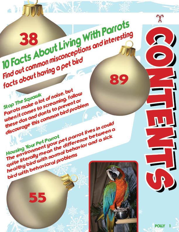
2. Contents: same font choice issue, although the less angled line of type are much better. Also, it will be important that the correlation between the page #s on the ornaments and the blubs about the related articles become clearer. Right now all that overlapping is simply confusing. I don’t know what article starts on what page.
3. Spread – second page holds 6 separate elements (3 photos and 3 text frames). You really need to position these differently so I know what photo accompanies what blurb.