Thursday, February 11, 2016

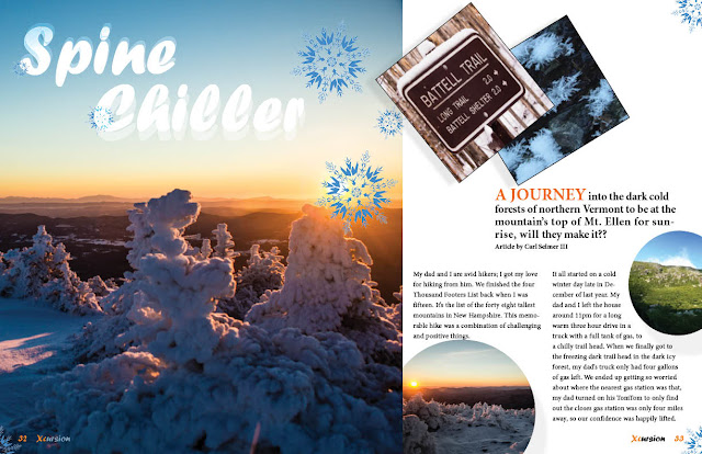
Project was assignment for Publication Design class. Assignment was to create a magazine cover, contents page, and feature spread. My subject was based off of my love for hiking. So my target audience is anyone who loves hiking, and having outdoor adventures.

 I made no edits to the cover page. So far but when it comes to printing the cover again, I will have to make modifications with the orange, so it won’t print out semi transparent.

The contents page photos were given a miner drop shadows, so they would each give a sense of perspective against the background content, and each other. That also goes for the feature spread pictures as well. On the feature spread I made a few changes to the secondary heading “A JOURNEY ” I enlarged the fraise, and decided to change color from black to orange for contrast. 

If anyone else has advice, or changes that they would make I would appreciate suggestions.

Project 1 Rework: Jim Henson Portrait Illustration


This project was done in Digital Illustration, and the project parameters were to find a photograph of someone we admire and to create a portrait illustration. We could include quotes and add a creative background if we wanted.

I chose to illustrate one of my biggest creative inspirations; Jim Henson. I chose a photo that also included what he was best known for, Kermit the Frog of the Muppets, whom Henson voiced and operated on the Muppet Show and in the Muppet movies. It was certainly an interesting experience, breaking down a photo into simplified layers of shapes-on-shapes, colors-on-colors; thinking of the entire thing as a big paper craft or collage definitely helped me enter this mentality. I didn't know at first what to do about a background, since the original photo just had a blank blue gradient. Rather than make something complex and intricate that would distract from the portrait, I instead chose to go the simple route and added a rainbow, which Jim and Kermit were famous for singing about.

Changes I made based on the peer review were fairly minor, such as some clean up around some of the edges and making the text larger and more readable (this is one of my favorite quotes, as well as my basic motto in life). The only thing I was not able to change was the fact that the blue, while it looks fine digitally, is different when printed; it's darker and more "purple-y." Unfortunately, with the file cabinet being locked with the Pantone color books inside, I couldn't access any color codes to get the desired shades of blue in print during the rework process; hopefully I can find access to one before the final print.

Other than that, I'm fairly happy with it as is, but I am definitely open to any other suggestions; this was one of my favorite pieces, and I want it to be as good as I can make it.

Wednesday, February 10, 2016

Project 1 Rework - Redacted Magazine

This project was originally an assignment for Publication Design. The assignment was to create a magazine cover, contents page, and feature spread, subject matter of choice.

The target audience for this magazine is intended to be fans of an internet-made fictional organization called the SCP Foundation. The Foundation's job is to contain anomalous objects and beings, study them, and protect humanity from the dangerous ones. SCP is also a community writing project, with new anomalies being added to their Wiki often by their fans. The title, "Redacted" was chosen due to its frequent use in SCP related writings. The title font, Bauhaus Std., was chosen because it is the same used in their official logo. I used Agency FB as a secondary font due to its scientific/secret-agency feel. The artwork used in the cover and contents was done by an artist known as Sunny Clockwork, links to his original work are below. The drawing of Dr. Bright on the contents spread I was unable to find out who the original artist was.

When I finished the project for class, I was happy with it, but upon further review and evaluations from my peers, I saw several changes that needed to be made. The majority of the reworking I did was on the contents page. Before, I had a photograph of paper in the background. Unfortunately it appeared grainy and inconsistent with the rest of the theme, which is much more simplistic. I redid the paper background in illustrator, brought out the reds a touch in the Dr. Bright drawing, and did a bit of re-positioning and re-sizing.

I would like thoughts on ways to further improve this project in any capacity.


Sunday, February 7, 2016

My Three Online Portfolios in which I Admire:


http://fevenamenu.com/envo.html
Fevan Amenu; Graphic Designer
This person is talented and artistic, the layout of her portfolio has impressed me and inspired me. First the layout is simple yet a lot of variety showcasing her talents. Navigation simple her design is laid out to lead ones eye to exactly where she would like one navigate. I will continue to look back at her designs and use her work for inspiration.

http://dotmick.com/#
Michael Larcheveque: Graphic Designer
This portfolio caught my eye because at first I thought plain, simple, boring until I navigated my way through. It starts out black & white, I am not a fan of black & white. The layout on his home page is circles containing his work as one clicks on the circle image a page opens in full color of the his designs. Very interesting and unique.

http://stefivanov.com/
Stefan Ivanov: Graphic Designer
I must say; this portfolio is my favorite. When one opens the page as the page loads a little figure is running in place very interesting to watch. This shows me imagination and talent to be able to pull this together. Then once the page loads a pair of eyes wearing glasses appears and the eye blinks again the talent to pull this together and it works. As one clicks around you will find the layout very interesting and little surprises. I think this person has very strong web talents and knowledge I hope I can come close to this type of talent.(must see)


Three Online Graphics Design Portfolios

David Carson

http://www.davidcarsondesign.com/

The Site:

The first thing that is immediately noticeable is the fact that it scrolls left to right and not down.
It is quite jarring to expect the up to down range of motion and be presented with a different one.

The Artwork:

Interesting use of type: sometimes handwritten, sometimes contrasting typefaces, and ultimately the way they are used is often visually interesting. The visual texture he uses in his work separates him apart as well. He makes equal use of neutral and pure colors for similarly stimulating visual effect.


Alex Pierce

 http://thegeekdesigner.com/about/

The Site:

 Heavy use of typography on the surface, but in the sections the images move as the page scrolls down. The site utilizes a palette of grey and orange.

The Artwork:

The work is generally monochromatic, although sometimes it reflects the site in that it pairs a neutral with a bright color. The work has a feathered or glowing appearance, which makes it very pleasing to look at.


Gravual

 http://gravual.com/en/intro-2/

The Site:

They are graphics design few working in a collective. The images present are framed inside the browser, with plenty of room to breathe.

The Artwork:  

The group handles negative space very well in their design, but also the way they present the
pieces is phenomenal. In a sense, they are using design in the way they present their designs
in their online portfolio.

Saturday, February 6, 2016

Three Inspiring Graphic Design Portfolios

Just Creative/Jacob Cass
http://justcreative.com/portfolio/#all
I really like the logo designs in this portfolio, as well as the overall easy-to-use website layout. Logo design is something I've been interested in learning a bit more about, and this portfolio gives me some ideas to reference.

Fabricio Brochier
http://fabriciobrochier.prosite.com/27497/home
I really like the bright, colorful nature of this portfolio and the work within it. The designer is also quite the illustrator, and this portfolio contains one of my favorite things: character design. It is also pretty great that the designer includes concept sketches of the characters as well, to see the progression from initial idea to finished design.

Alisara Design
http://alisdesign.prosite.com/
I think this portfolio has a really great range, from package design, to books, invitations, t-shirts, websites, logos, and even pencil drawings. I also like the different aesthetic choices that can be seen in different projects (see: the designs for the research and technology symposium as opposed to the illuminated manuscript style of the Bangkok Project), and yet it still seems that they were all designed by the same person; the pieces chosen all seem to work together when placed in the same space.

Thursday, February 4, 2016

THREE REALLY INSPIRING PORTFOLIOS


A.H.A. DESIGN


I like the ease of navigation, the animations on a few of their work. The color contrast, shape, and unity between all the different parts of their work.

Christopher Lee


I like the different colors, well known layout, great illustrations, and how he presented his work, and the layout of the descriptions.

Robby Leonardi
I enjoy the simplicity of the navigation, the illustrations throughout his portfolio. The colors, contrasts, shapes, values, and unity between all the different examples of his work. But also the use of texture throughout his entire portfolio. I was surprised it wasn’t as unique as his resume that I found beforehand. Which the link is below, if anyone else is interested in checking that out.